Task 4 -How did you use media technologies in the construction and research, planning and evaluation stages?
I used a prezi to show one of our potential ideas for a music video. Prezi is a good tool to use because it's very visual which people like. When describing what your video will look like it's better to have images so that the audience can get a feel to what it will look and feel like.
To research into similar artists I went onto the internet to go on artists (Kacey Musgrave) websites, twitter and YouTube channels to have a look at what they were like and what kind of things we should
be including with our products.
I also used the internet to email cast members of rehearsals but that hardly ever worked because no one ever seemed to check their emails therefore we started to text people because we figured they would have their mobiles on them nearly all the time.
Just before rehearsals I filmed the storyboard using a Sony NX5 camera. I did this to know what our video would look like. This is also let us match the music to the images to get a feel of what it will look like.
When it came to rehearsals I filmed our main artist (Fen Xanadu) on a cannon 7D which gave a great look to it. This also got her used to working in front of camera other than an Iphone which we are all used to.
Sadly I did not have the cannon 5D camera with me when I did a practice shoot on our narrative section. I filmed this using an IPhone 5 which worked well because I could easily upload the footage to the computer. I then did a mash-up of the two different videos and put it on YouTube. I emailed this video to a bunch of people to get feedback. They emailed me back with things they liked didn't or did like. From this
We learnt a lot from filming these videos. We realised that our main artist Fen looked slightly to sad on camera therefore she had to practise smiling in front of the camera. We found this with our narrative actress as well. She looked a bit serious at times so like Fen we asked Darcy (narrative actress) to practice not being to stiff and sad but to loosen up and look happier in front of the camera.
When editing the album cover I used Photoshop. I changed the image from colour to black and white to make it more flattering.
The font we used was Brain Flower. We got the font from a website called Da Font. Da Font is a website which allows you to download many different fonts. I found Brain Flower font and thought it would fit with our artist.
For our inside cover we wanted to add flowers to the pictures to fit in with the flowers in the music video. This is how it started - with a few pictures
I put some flowers down over the photos and took a photo of them (close up). I then thought about the colours of the flowers in the music video and remembered they were more pink.
I used the quick tool selection on Photoshop to highlight just the flowers.
I then used the colour balance to turn the purple flower into a pink flower by turning up the red colour balance..
This was the outcome...
For the back cover I took a photo of the wood of the guitar then added the same petals as before onto the image to create a nice border for the track list. The track list font is Brain Flower. I used the same font as the front cover in order to keep the same look and feel.
After putting all the album artwork together I realised that the only part of the album which was in black and white was the front cover. I loved the front cover being in black and white and so I decided to change the back cover from colour into black and white so it looked more as one piece.
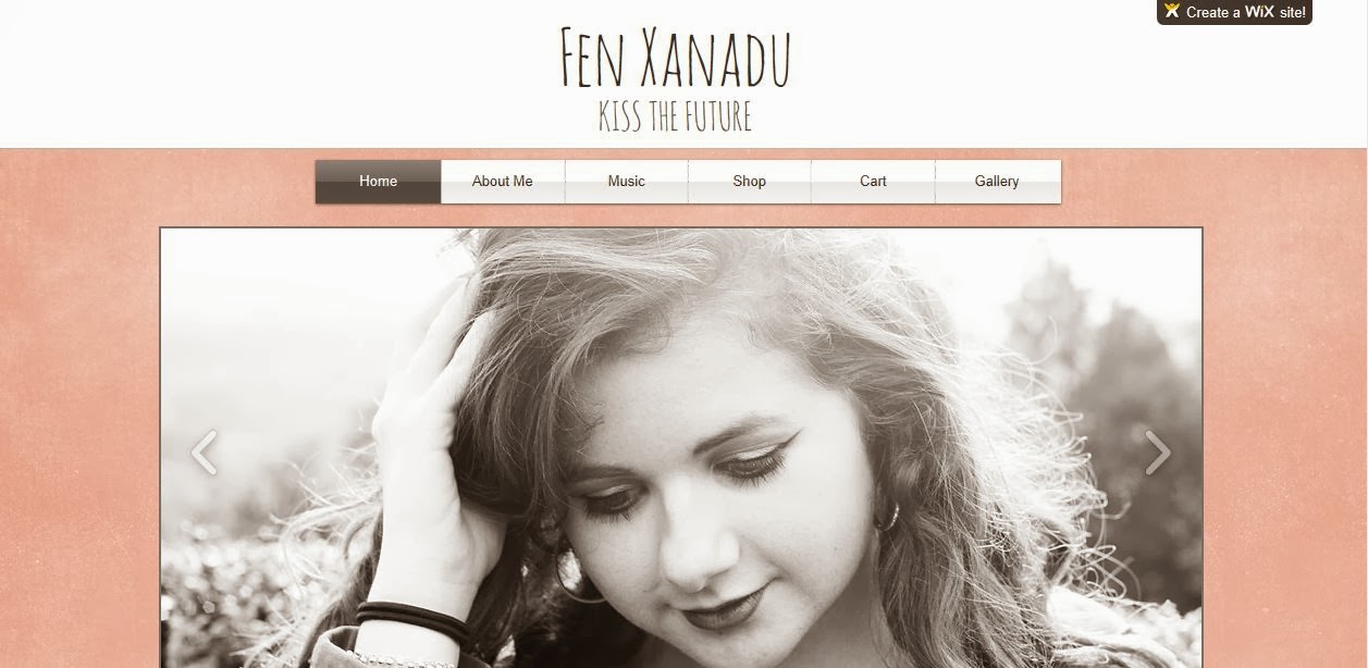
When creating our artists website we used Wix.com. Wix is a simple program which lets you design and create websites.
We chose you put a slideshow at the top of the website which shows different close ups of our artist. The large picture of her face shows her as being a star. Only big artist would have their own website with a huge picture of their face on it. The lighting on the photo is natural lighting to give it this soft organic feel because she is an organic singer songwriter.
The font we chose was called Animatic. This font is just like the font Brain Flower which we used for our album cover. We could not use Brain Flower for the website as the website only gave us a few to choose from but Animatic and Brain Flower look the same so it worked well. Again the font looks homemade, handwritten, personal and most of all natural fitting with the organic and natural look and feel.
This was the old version of the website. As you can see it's not very interesting to look at. The picture is was to big, it took up most of the page. The new website design is more engaging. Just bellow the picture we have a few details so that the audience know there .
We then decided to change the look of the slide show. It took most of the page so you could not see what was bellow it. Now the picture is not so big and you can see a few details bellow it. This means the audience will know to scroll down the page to get more information.
The layout of the page is quite informal to give you a sense that this artist is relaxed. The text boxes we used are underneath each other so it is easy on the eye - Just keep reading down. We chose that pink background because it is feminine, fresh and has that natural look. We didn't choose a big bold colour like bright green. The soft pink reinforces this is a natural organic artist.
 Our video was shot using a Sony Fs100 with a 80mm prime lens which is a high quality lens which is flattering on who ever is being shot. When editing our music video we used Final Cut Pro. The whiteness in the video was slightly yellow and we wanted to the colour's to be rich. We wanted the grass to be greener and her red lips to be redder so we turned up the saturation to give this energy and beautiful look. We wanted it took natural and not fake so we took down the contrast to give it that organic look.

Before

After
As you can see the colours in the first one are quite bland and dark but after I increases the saturation the blue (especially) and the reds look richer and more vibrant. The look is more softer than before making her look more alive and natural.