Saturday, 1 March 2014

Task 4 How did you use media technologies in the construction and research, planning and evaluation stages?

Task 4 -How did you use media technologies in the construction and research, planning and evaluation stages?


I used a prezi to show one of our potential ideas for a music video. Prezi is a good tool to use because it's very visual which people like. When describing what your video will look like it's better to have images so that the audience can get a feel to what it will look and feel like.  


To research into similar artists I went onto the internet to go on artists (Kacey Musgrave) websites, twitter and YouTube channels to have a look at what they were like and what kind of things we should
be including with our products.   
I also used the internet to email cast members of rehearsals but that hardly ever worked because no one ever seemed to check their emails therefore we started to text people because we figured they would have their mobiles on them nearly all the time.  
 
Just before rehearsals I filmed the storyboard using a Sony NX5 camera. I did this to know what our video would look like. This is also let us match the music to the images to get a feel of what it will look like.  

When it came to rehearsals I filmed our main artist (Fen Xanadu) on a cannon 7D which gave a great look to it. This also got her used to working in front of camera other than an Iphone which we are all used to.

Sadly I did not have the cannon 5D camera with me when I did a practice shoot on our narrative section. I filmed this using an IPhone 5 which worked well because I could easily upload the footage to the computer. I then did a mash-up of the two different videos and put it on YouTube. I emailed this video to a bunch of people to get feedback. They emailed me back with things they liked didn't or did like. From this  


We learnt a lot from filming these videos. We realised that our main artist Fen looked slightly to sad on camera therefore she had to practise smiling in front of the camera. We found this with our narrative actress as well. She looked a bit serious at times so like Fen we asked Darcy (narrative actress) to practice not being to stiff and sad but to loosen up and look happier in front of the camera.

When editing the album cover I used Photoshop. I changed the image from colour to black and white to make it more flattering.   
 

The font we used was Brain Flower. We got the font from a website called Da Font. Da Font is a website which allows you to download many different fonts. I found Brain Flower font and thought it would fit with our artist.
 
For our inside cover we wanted to add flowers to the pictures to fit in with the flowers in the music video. This is how it started - with a few pictures 
 
 I put some flowers down over the photos and took a photo of them (close up). I then thought about the colours of the flowers in the music video and remembered they were more pink.
 
I used the quick tool selection on Photoshop to highlight just the flowers.  
 
I then used the colour balance to turn the purple flower into a pink flower by turning up the red colour balance..
 
This was the outcome...
 
For the back cover I took a photo of the wood of the guitar then added the same petals as before onto the image to create a nice border for the track list. The track list font is Brain Flower. I used the same font as the front cover in order to keep the same look and feel. 
 
After putting all the album artwork together I realised that the only part of the album which was in black and white was the front cover. I loved the front cover being in black and white and so I decided to change the back cover from colour into black and white so it looked  more as one piece.
 
 
When creating our artists website we used Wix.com. Wix is a simple program which lets you design and create websites.
 
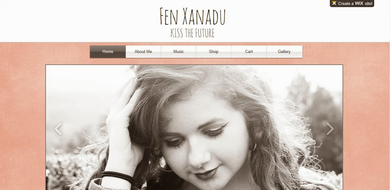
We chose you put a slideshow at the top of the website which shows different close ups of our artist. The large picture of her face shows her as being a star. Only big artist would have their own website with a huge picture of their face on it. The lighting on the photo is natural lighting to give it this soft organic feel because she is an organic singer songwriter. 
The font we chose was called Animatic. This font is just like the font Brain Flower which we used for our album cover. We could not use Brain Flower for the website as the website only gave us a few to choose from but Animatic and Brain Flower look the same so it worked well. Again the font looks homemade, handwritten, personal and most of all natural fitting with the organic and natural look and feel.

This was the old version of the website. As you can see it's not very interesting to look at. The picture is was to big, it took up most of the page. The new website design is more engaging. Just bellow the picture we have a few details so that the audience know there .

We then decided to change the look of the slide show. It took most of the page so you could not see what was bellow it. Now the picture is not so big and you can see a few details bellow it. This means the audience will know to scroll down the page to get more information.

 
The layout of the page is quite informal to give you a sense that this artist is relaxed. The text boxes we used are underneath each other so it is easy on the eye - Just keep reading down. We chose that pink background because it is feminine, fresh and has that natural look. We didn't choose a big bold colour like bright green. The soft pink reinforces this is a natural organic artist. 

Our video was shot using a Sony Fs100 with a 80mm prime lens which is a high quality lens which is flattering on who ever is being shot. When editing our music video we used Final Cut Pro. The whiteness in the video was slightly yellow and we wanted to the colour's to be rich. We wanted the grass to be greener and her red lips to be redder so we turned up the saturation to give this energy and beautiful look. We wanted it took natural and not fake so we took down the contrast to give it that organic look.   

Before

 After
 
As you can see the colours in the first one are quite bland and dark but after I increases the saturation the blue (especially) and the reds look richer and more vibrant. The look is more softer than before making her look more alive and natural. 
 

Sunday, 8 December 2013

Changing Our Products After Feedback Session….

We changed our T-Shirts after the audience said they were not fond of our last ones…. We put a picture of Fen on the tops because our audience said that is what most artists did. We changed our font to make it fit better with our website fonts so the T-Shirts are no longer different to everything else.


The audience did not like the music page because they thought the title of the page "music music music" did not fit the country style. We have now changed the tile to just "music" which fits in with the rest of the titles. The audience also said they wanted to see a theme running through the website so we decided to use polaroid pictures on some of the website's pages. 
The audience also said they did not like the fact that there were to many fonts on the website so we changed it by just having two fonts which works well because now we have a nice theme running through the website.


http://madelainesalvage.wix.com/fenxanadu - The website has now been finished and is now live online...

Saturday, 7 December 2013

ALBUM ARTWORK…
At first we wanted to have this picture as the album cover because most of the artists we looked at had their album cover as the artist looking downwards. When we showed an audience this they said it looked more singer/songwriter rather than country. They said to make it more country maybe we should add a guitar. The picture bellow is the album cover. 

Before we had leaves surrounding the title (tying in the leaves in the music video) but the audience said they looked a bit tacky and homemade. The font was originally to different to the website font so we have changed it to make it the same as the website. The font is called Amatic SC. We got rid of the leaves which I think was a good decision because now it looks more professional.
 When brainstorming the ideas for the album artwork we decided we wanted to use the photos from the suitcase(storyline section - the photos darcy throws off the bridge) because we felt this would connect with the video. Originally in the music video we wanted to have the photos falling from the bridge into water, so we decided that the inside cover of the album could be of the pictures in the water but in the end we could not film the scene in the water so we decided that the inside picture of the album should be the photos on the ground covered by leaves.

The back cover of the album cover is of a close up on some guitar wood which we felt fitted nicely with the guitar on the front cover…We were going to have a picture of a guitar on the back cover but felt there would be to many guitars therefore, we had a close up on the wood of the guitar instead. We thought this would be a nice effect because its not that obvious at first but when you really look at you will realise its the wood from the guitar… 


Audience Feedback

Today we showed a group of people our three products(video, album cover and website) because we wanted feedback on them. We wanted to know if they could tell what kind of artist she was and whether or not all three products linked together.

All together they felt the three products fitted together but there were a few things which they felt we could change to make them even better.
They liked the website because they felt the front page fitted really well with the album cover - They both had homemade arty qualities about them - The selotape over the Twitter and Facebook   

gave it a handmade look which worked well with the leaves on the album cover which looked like they had been stuck on. They said we should keep a theme running through the website because the homemade look is only on the first page.
The music page title needs to change. At the moment it says MUSIC MUSIC MUSIC but the audience said that that didn't seem appropriate(felt like that would be on pop website) so we changed the title to just 'Music'.  

The audience felt like there were too many fonts on the website. They said we should stick to two fonts so that the website feels like one website rather than being a bit disjointed.

The audience said they did not like the T-Shirts because the design felt completely different from everything else. If we changed the font of the T-Shirt then that would better(the font at the moment was a bit big and bold) They said maybe put a picture of Fen on the T-Shirt because that's what lots of artists.

They loved the front of the album cover but were not to keen on the leaf title. After seeing the music video which they loved(they said it was what they expected)they said the water on the album cover did not fit in with the rest of the products. 

Thursday, 5 December 2013

Second shoot evaluation:

We arrived in the studio the day before the shoot so that we could set up.  The backdrop had been painted for us but we needed to get all the props. We had bought lots of real flowers which we put into vases and placed them around the set as well as some artificial flowers which we placed on the piano and in the drum kit to make it look colourful and more fun. We set up the drum kit and the piano in the right place and scattered leaves all over the place to give it that outdoor country feel. We then spotted this Astroturf grass carpet which we felt would be nice for two reasons. The first is that it adds to the outside look and adds colour to the set. The second is that we could extend the set if we added the carpet on which meant Fen could stand in front of everyone else instead of being cramped in next to the drums(this allowed her to move it little whilst performing).

We next day we arrived and we had a little panic because no one was there except for the drummer and guitarist.....Our pianist had an acting lesson which she had to go to for an hour so we panicked that we would miss an hour of shooting but luckily setting up the cameras and a quick rehearsal took an hour so she was back in time(our main artist Fen had arrived within that time) and we could start.
The set looked great, the actors looked great! All we had to do now was shooooot!  

 
We started by filming still shots. We started by filming a few  wide shots of the whole set which went really well except our drummer looked a bit uncomfortable to start with but he soon eased into it. 
We then did a few close ups on Fen which started of not being amazing because she wasn't smiling as much as we wanted her too but it was because she was just getting used to performing in front of the camera.
We then did close ups and medium shots of the guitarist and the pianist which went really well - They were both really comfortable in front of the camera and did a few smiles at each other which made the band look like a real band.
 
After about an hour everyone was comfortable in front of the camera - Fen was smiling and dancing and the other band members were doing well. ONE BIG PROBLEM we faced was that we realised the drummer was out of time with the music which looked awful but we filmed him anyway and tried to get him in time with the beat but we came to realise that he wasn't a very good drummer so we couldn't do too much with him. However he did have a good vibe and he became much more confident as the shoot went on and he smiled at the camera and occasionally winked at the camera which worked well.               
 
 
After lunch we got the track out and did some tracking shots. These were my favourite shots of the day because the still shots become a bit repetitive after a while and it is nice to have shots which moves - It brings energy and lets the artist move a bit more and allows them to follow the camera with their body instead of standing still in the same place for still shots. I felt this was when Fen was at her best. She really connected with the camera and was able to dance a little as the camera moved around her. 
 
We all took turns filming and doing playback. I filmed most of the still shots whilst my other team members filmed the tracking shots whilst I did playback and held the lead so that it didn't get stuck under the camera. I loved the tracking section of filming the best but found filming the most fun because I was able to control the camera and watch the live action as well as seeing it through the camera.

We all worked well together and were able to swap jobs easily. We listened to each other and helped each other when we got stuck. The main thing I learned was to take lots of shots because when it comes to editing the more shots you have to choose from the better.   

Wednesday, 27 November 2013

Website

We have been using the website Wix to create our website for our country artist.
 
This is our front page for our website. The big picture of Fen is a slide slow to show Fen in different situations and to give the fans some pictures which they can look at. It gives the front page some variety rather than just having the same picture every time you go on the website. After researching into different country artists websites they all had links to Facebook pages or twitter accounts so we added in a Facebook and twitter account for Fen which her fans could look at. 
This is her twitter page
 
We had lots of troubles using Wix because every time we moved a layout on one page it changed every page which became a serious problem because we became restricted to how much we could change. I then decided to create a new website for our artist but using a different layout which would be easier to use.
This is the new website which I have created. It still has the same feel as the old website but has a nicer layout. I was researching into other country artist and came across Taylor Swift who had a really good section to her website which was labelled About Me. It was full of random quirky facts about Taylor which bought her fans even closer to her. We decided to do this with her artist so that her fans could get closer and find similar qualities to Fen.

Wednesday, 20 November 2013

Editing music video…
This the editing I have done so far for the music video. I have split the clips up into three sections - Begging, middle and end. The editing has gone well so far but I found using Final Cut Pro difficult at first(its more complicated than what I am used to-Imovie)  but after a while I got the hang of it and now I feel I can use it well. The feedback I got from the teachers is that I need to cut on the end of sentences rather than in the middle of a sentence otherwise it looks a bit messy. Another thing which could be better is that I need to spread out the storyline section because at the moment the storyline bit happens all to quickly - I need to spread it out during the music video otherwise the audience will get bored if we mainly have shots of Fen.I also need to add in the last strand which we will shoot in the studio…Once we have filmed this section and I can make the changes needed and finish it off….


Monday, 18 November 2013

First shoot day evaluation....

We packed up the car with the camera, suitcase, photos' and flowers and off we drove to Bramley with the cast and crew. When we got there we walked about 5 minutes towards our first location
(the first bridge).


When we got to the bridge we got the camera out and set up our first shot. We placed Fen under the bridge next to the wall for our still lip sync shot. We filmed a close up, long shot and then a medium shot. We then did the same shots but on the other side of the wall but we for one of the shots we tried Fen looking away from the camera which was nice because it didn't make it as intense.

There was a tiny pool of water with a plank over it which we filmed as Fen crossed it. This was nice because it showed the audience how she got to the wall. We then did a still of Fen walking down the pathway towards the bridge. We filmed her walking looking straight into the camera then without her looking past the camera(again for variety). We also tried her walking without singing the filmed her walking away from the bridge for the final shot as she walks into the future.

At the begging the sun was out so we got one shot of her lip syncing with the light on her face which was the best shot because it made really atmospheric. Sadly after this the light died down but at least it didn't rain.
We decided to shoot Fen in her hat for the walking and the standing still section which was worked well because it was a contrast to our other actress who did not have a hat. The hat also looked really nice on fen and brought out the blue in her eyes.

Overall the Fen section went really well. It turns out the best shots of Fen where when she was not looking into the camera so it would have been nice to had got more shots of that but the shots we did get will work really well. If the sun had stayed shining then that would have also been perfect but when we come to editing then I am sure we can up the contrast or brightness of the over the shots to make them look the same.

We then got back into the car and drove to our next destination which was the second bridge. Our actress Darcy was wearing a red dress with flowers on which I had chosen. It fitted in really well with the theme of flowers and the red stood out really nicely making it look great on camera. We put all the photo's and flowers in the suitcase whilst she was carrying it to make it heavy for her to show that she has a lot of memories. We filmed her a couple of times walking towards the bridge but had to stop a few times due to cars driving down the track getting in our way.
Once the cars went by we carried on. We then filmed her from the front walking towards the bridge to show different angles. It was very cold outside so in-between shots we had to cover her up with warm coats so otherwise she would look cold on camera and feel uncomfortable
NEW PHOTO SHOOT...............

I took a photo shoot of Fen for our album cover and website images because even though those pictures of Fen were great , they were not taken by any of the group therefore we did not feel we could use them. I went out and took photos of fen then edited them, trying to capture the style of the previous photo's because we loved those photos.

I took the photos outside in the greenest area I could find because I felt it was important to give it a country look. Some photo's are with Fen and her a guitar to give it that songwriter feel then some are her on a bench which I found(the bench had flowers on it which I felt was perfect as it is a theme throughout our digi packs).
These are all the edited the pictures
 
Here are the best 5 images which are ready for the website.


Monday, 28 October 2013

THIS IS THE FINAL TRACK!!! Fen recorded the track again making it even better than before. She cut it to 3 minutes and added harmonies. IT SOUNDS GREAT!


These pictures are potential album cover photo's. Some are taken outside in a field to give it that country vibe. Some photos are taken on a bed with a guitar to show the artist as a songwriter. The rest are taken inside by a window to give it that atmospheric look.  
 The only problem is that these photo's were not taken by any of the group members.


I like the photo's with Fen writing with her guitar because this shows her as a true organic songwriter.